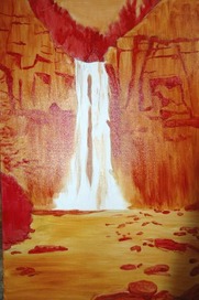
 This is a painting I started of Taughannock Falls in Trumansburg, NY. The following is a progression of the different stages of the painting. It is done in oils on a 24"x36" canvas. First, I decided to do my under layer in reds, oranges and yellows. I did this to set my tones and values and to establish a vibrancy that would come through in the finished work. It was also helpful in blocking in the different aspects of the scene like the rocks, trees, etc. The colors I used were vermilion, cadimun yellow, burnt sienna, and yellow ochre.  I began blocking in the rock shapes with mixtures of dioxazine purple, ultramarine blue, cobalt blue, burnt sienna, and white. I loved the contrasting purple alongside an almost periwinkle blue, and decided to go with that color palette for the rest of the rock formation.  Here I finished the bottom of the rock formation and darkened it with burnt umber mixed with the ultramarine blue and purple. 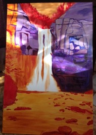 I began the left side of the rock formation continuing with my color palette. As I finished the work for that day, the afternoon light came in through the window and fell on the painting in such a beautiful way. 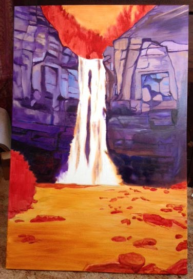 I finished blocking in the left side of the rock formation. I will add more detail later on but now it is time to start on the rocks in the water. 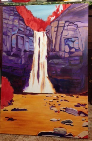 I painted the rocks in the water with yellow ochre and white for the tops and different shades of purple for the sides and the bottoms. The rocks are lighter on top where the light hits them. I also painted the sky with a mix of mostly cerulean blue, along with a little cobalt blue and white.  Now it is time to paint the water. I used cobalt blue with a little ultramarine blue mixed with white. I thinned this paint somewhat and the yellow ochre underneath helps to give it a blue/gray hue. I also lay in a little purple to tie the water to the rock. 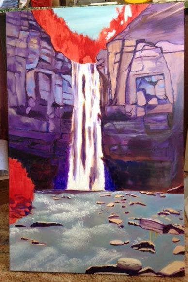 I added white to the water below to bring it to life! I used a Bob Ross 2" brush. I use the flat edge of the brush and "hit" the white onto the canvas. There are no strokes. It gives the effect of rushing, moving water. For those who are old enough to remember Bob Ross on tv (with his happy little clouds and trees), I will be eternally grateful for his happy little 2" brush!  Now I move on to the bush to the left and the trees at the top of the falls. I decided on a fall season because I didn't want to get rid of all the red in the painting. Red really makes a painting pop and I try to include it if I can. I painted some of the trees on top with a chrome yellow. For the bush to the left, I also used chrome yellow and added some sap green and terre verte.  This is a closeup of the bush. I wanted to lay in some rocks to give the bush interest, so I used purple for the bulk of the rock and then highlighted the tops with white.  I added greens to the trees above the falls and also added some leaves to branches entering the scene from the left, above the bush. Now it is time to work on the waterfall - to fill in gaps of color with white and to create a mist at the bottom of the falls. Again, this was done with my Bob Ross brush. 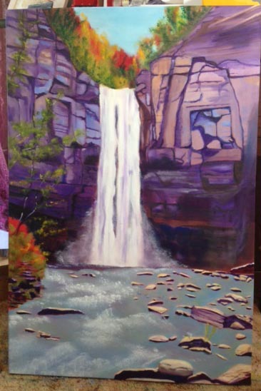 I finished up the branches to the left and put in some dark tree trunks and limbs at the top. The painting is complete! I hope you enjoyed viewing the process!
0 Comments
Leave a Reply. |
AuthorI thought I'd write a few thoughts on art, life and whatever else comes to mind. Archives
March 2023
Categories |
 RSS Feed
